Twitter
 Facebook
 RSS
RSSWith the advent of CSS3, there are a variety of methods used to create interesting text effects allowing designers to exercise more creativity and produce more visually pleasing web pages. Browsers such as Safari and more recent versions of Firefox, Opera and Google chrome support the CSS3 properties used to change the appearance of text without having to create images.In this article we provide 12 Striking CSS3 Typography Experiments to get web designers started.
CSS Poster: Three Laws of Robotics
Another experiment in CSS3 techniques. This one uses lovely bits like box-shadow, border-radius, @font-face, transform, box-sizing, text-shadow, RGBa, and maybe some more stuff.
CSS3 Tilt-Shift Text experiment
Where are the trees is an experiment trying to create a Tilt-Shift effect on Text using CSS3.
Subtle CSS3 Typography that you’d Swear was Made in Photoshop
Thanks to text shadows, outlines, transitions, and even text gradients, we can now create cool typography that you’d swear had to be made with a program like Photoshop. Nope, all CSS3 baby! Let’s take a look in this video quick tip.
CSS3 glass text effect
ZEPPELIN is an experiment trying to create a glass text effect (refractive index) with CSS3.
Stereoscopic 3D effect with CSS3

CSS typography experiment
This is a quick experiment that reproduces an image from I Love Typography using nothing more than simple semantic HTML, CSS 2.1, and modern browser implementations of a couple of CSS3 properties.
CSS3 Transforms & @font-face Experiment

CSS3 Background-Clip & @Font-Face

Curtis CSS Typeface

CSS 3 Transform Experiment
Transform is a pretty exciting feature that’s been implemented in CSS 3. So why haven’t we used more of it in our designs?
Create a Vibrant Digital Poster Design with CSS3
CSS has come a long way in recent years, and with new browser support for a hand full of CSS3 properties we can begin to replicate design styles directly in the browser that beforehand were recently only possible in our design applications.
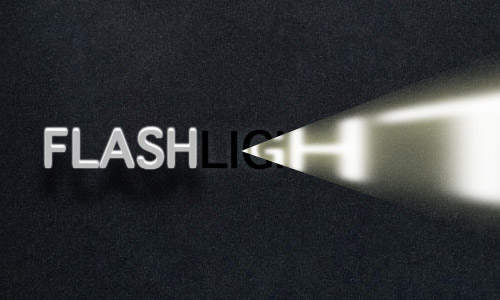
Flashlight
FLASHLIGHT is another CSS3 experiment. Again the text color is set to transparent and text-shadow is added. For the hover effect a rotateY transition is used with a low perspective.Works in Safari only. Booo!